FINALIST IN – Student Designer – CREATIVE VISION
Designed By – Zhaoying Gu
Registered Training Institution – Queensland University of Technology
Design Inspiration
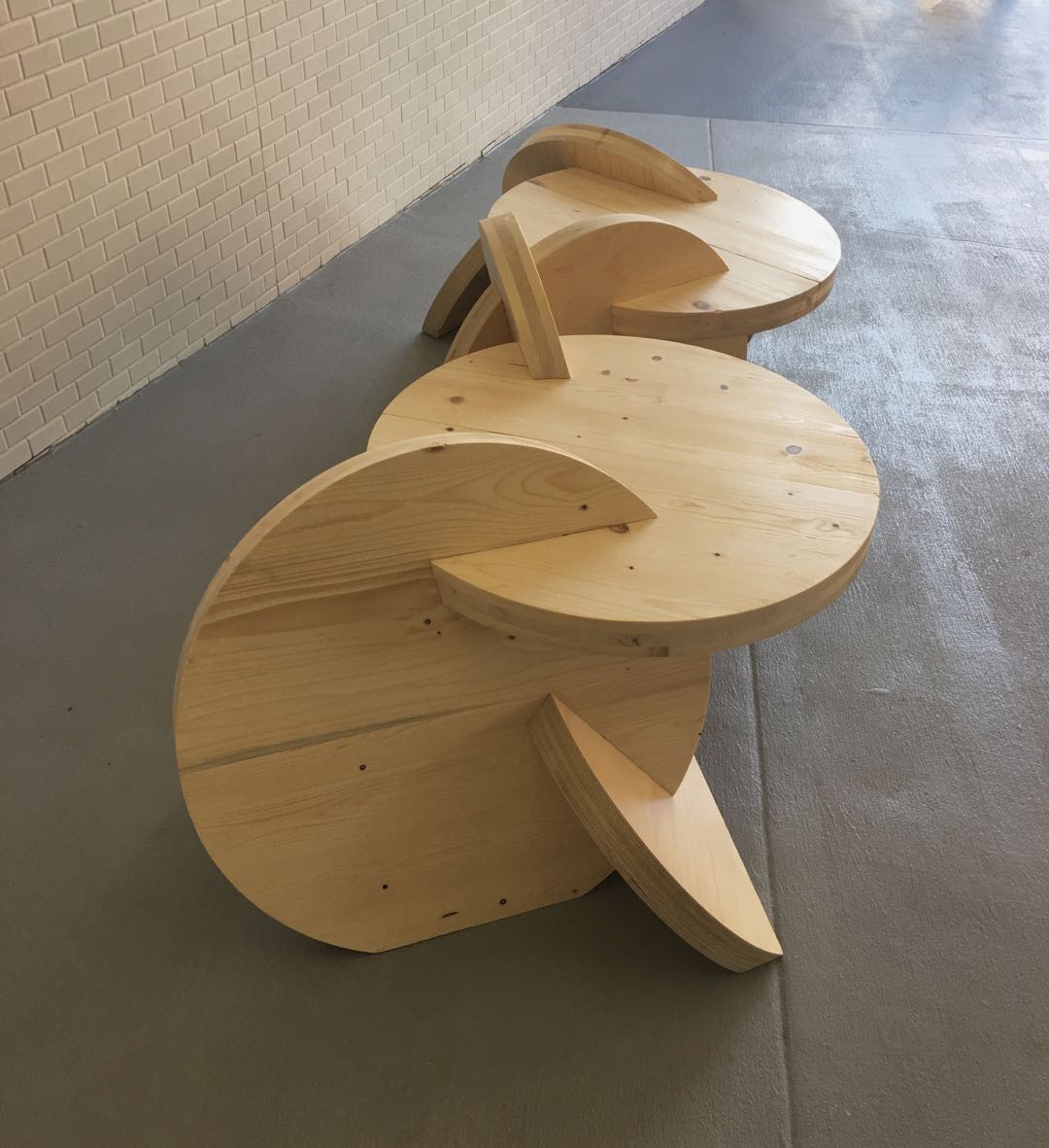
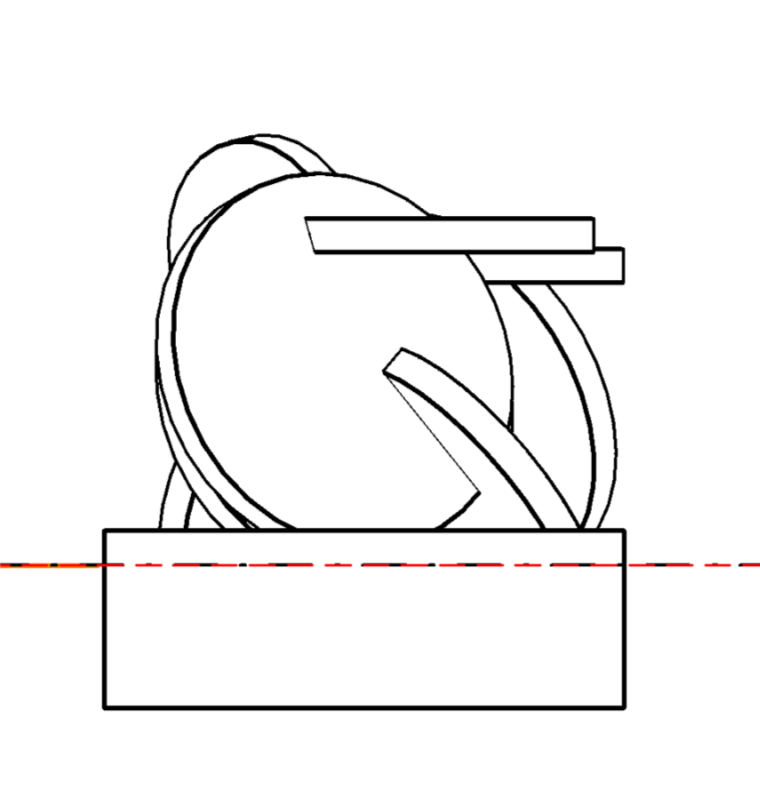
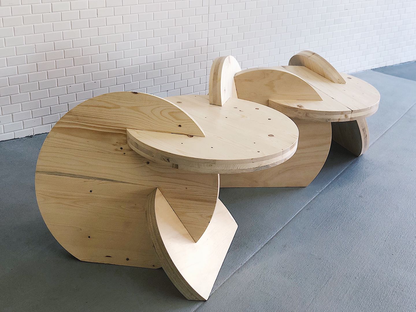
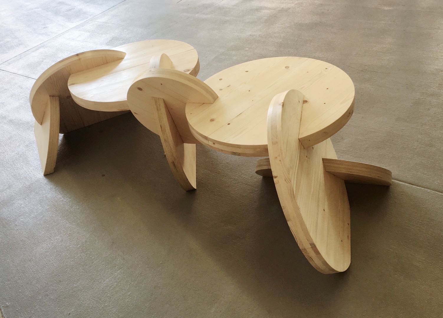
CLICK is a Showpiece Foyer Furniture Piece for 25 King Street Office Building (Lendlease). The term ‘click’ has two meanings that represents connection and cooperation, which is indicated the concept of our design. So the whole piece includes 4 clicks. The first click is the connection between the joints and the panels. The design consists of 8 panels, the joints on these panels are designed with different angles. For all the joints, they work like puzzles, which means there is one and only one joint that can intersect with it. The second click is the cooperation between the inside joinery and the outside structure. We created an outside view that looks like the whole structure is self-support which means the users would not see any external fixations on the piece. But the internal joineries are more complicated than this simple outside view. These joineries are able to support and make the balance for the whole structure.
This idea also relates to the concept of inside and outside. The third click is the connection between human and the design. I want the design to be friendly for everyone. The reason we use circular shape in the design is because I think it is more approachable for users. It doesn’t have any sharp angles like normal chairs, which allows people to approach in different ways without worrying about whether they would hit themselves. The final click is the connection of the whole piece and the space.
The materials include CLT and plywood. The use of CLT and plywood is to present the idea of nature and sustainability. In the design, we shaved the bottom of the panels that contact with the ground, in order to create a view that makes the piece seem like growing out of the ground just like plant growing from the soil. It emphasises the relationship between our design and the space.
Design Solution
Satisfied the theme of INSIDE OUTSIDE. Easily for people to carry and fit into the place. Easily to be assembled and disassembled.
Size
800W x 2000L X 500H
Materials Used
Plywood and CLT
Green Notes
The use of raw CLT and plywood is to spread the idea of greener and organic production, and to bring a contrast from the urban environment. It allows the visitors to feel a sense of peace, physically and mentally, also to be tempted to engage with Click.
Processes used in construction, including any new construction methods or applications adopted from other industry technologies
Each panel is designed exclusively to be connected in different angles and directions. This is to reflect on the theme by forming an enclosed space. Creating volume allows people to interact around the bench. The unique assembly is a starting point, and now becomes an unique bench seat. It consists of 5 CLT and 3 plywood panels. The negative space between the panels and ground creates an inside outside area. Inspired by the relationship between the human body and the urban environment, some of the panels are designed individually for ergonomics. This also provides an opportunity for the panels to be used differently.
Overall, this design demonstrates an abstracted appearance. People can see a similar structure from different views, it gives you a confused impression about the transformation of inside and outside. Maxi-fix is used for joining the seating panels.
By attaching or de-attaching the mitre bolts, the furniture piece can be separated into 3 parts for easy assembly and transport.


